Check out these logo design changes for June 2014.
Disney Channel
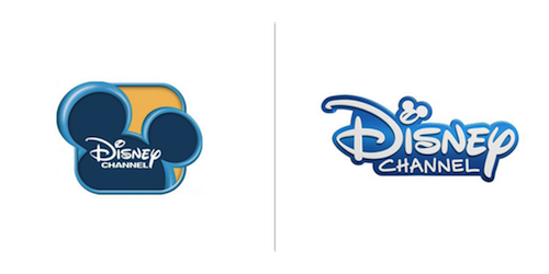
Contrary to our post about the, “Less is more” logo trend, Disney has given their logo a refresh but, has yet to adopt a flat design. With the type logo no longer surrounded by the box and mouse ears, Disney opted to make the ears smaller and incorporate it into the type logo itself. I think this makes for a much cleaner, distinctive, high quality logo.
Additionally, Disney mentioned that, “with some tweaking”, they could still incorporate Disney stars using the wand into commercials.
Hootsuite
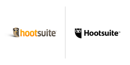
Hootsuite, the social media management system for brands, has truly simplified their logo. Completely black and uncluttered, this logo refresh gives Hootsuite a sophisticated look. I think that this neat, elegant redesign can help Hootsuite gain brand recognition as a high quality service.
Hotwire
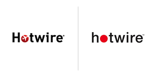
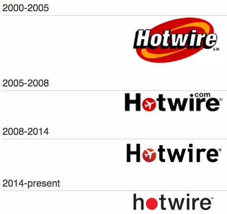
Like Hootsuite, Hotwire.com has opted for a flat design and decided to eliminate the plane from their logo. Additionally, they made the logo all lower-case and changed the typeface. I think this logo refresh is perfect for Hotwire. It’s trendy and convey’s their brand well. See below, the logo evolution of Hotwire over the years:
Moviephone
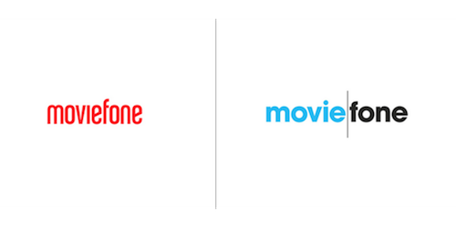
Moviefone has recently made a somewhat drastic logo change. Everything from the color, typeface and feel has been redone. There has also been the addition of a gray line between movie and fone. The square logo includes just the “m”, “f” and the line.
Same as mentioned over at Under Construction, I’m not quite sure where they’re going with this logo. With a phone service no longer, why the emphasis on “fone?” Moviefone’s website and app has recently expanded to include tv content as well.
Check out our past logo design roundups here.
~ Tara Urso, Social Media & Marketing Strategist

