

At insight180, annual reports have been part of our work for more than 25 years. In that time, we’ve created 75+ annual reports and strategic plans for nonprofit organizations—and many of those clients return year after year.
Throughout the years, the underlying purpose has remained unchanged: Deliver a comprehensive, transparent overview of the organization’s financial health, operational performance, and strategic direction to stakeholders.
But how annual reports are designed, delivered, and used has evolved with the times. Annual reports began as a regulatory necessity to ensure transparency and protect stakeholders. Over the decades, they’ve evolved from straightforward financial disclosures into powerful communication tools.
To talk about that shift, we sat down with insight180 Art Director Bethany Howell, who has been designing annual reports since joining the team in 2001. She’s witnessed this evolution firsthand—from information pieces necessary to organizations, to marketing pieces designed to impress, to vital digital tools that need to work harder than ever.
From Printed Financial and Leadership Information to Branded Digital Marketing Tool
Bethany’s 25 years at insight180 represent just one chapter in the annual report’s much longer story. For more than a century, annual reports served one primary purpose: regulatory compliance. Governments mandated that organizations publish standardized financial disclosures to protect stakeholders. These were straightforward, text-heavy documents—functional, not flashy.
But by the 1950s, something shifted. Annual reports entered their “Golden Age“—organizations began treating them as branding opportunities, investing in glossy printing, custom typography, and high-style photography. Reports became showpieces designed to impress and build a corporate persona.
Then came the digital era, and with it, another transformation.
Q: How has annual report design evolved over time?
Bethany: “When I first started, there was more opportunity to make reports feel special—things like die cuts, interesting folds, or unique sizes and formats. Since the advent of digital, the specially printed showpiece has become more of a relic. For nonprofits especially, printing budgets have decreased, and annual reports are more often produced as PDFs that live on a website.”
The shift from print to digital represents more than a change in format—it’s a move from tactile design to visual storytelling. Where physical reports once relied on embossed covers, specialty papers, and unique folds to create impact, digital reports depend on strong themes, compelling imagery, and strategic use of color and layout to engage readers on screen. Different medium, different craft—but no less special when done well.
The role of the annual report has evolved too—from information resource to branding showpiece to today’s hardworking marketing asset that supports fundraising, drives web traffic, and extends an organization’s story across channels. And the way they’re shared has changed accordingly.
Bethany: “We do a lot more promoting when the annual reports are published—sharing about them via social posts, sending special emailers with a link to download it, putting rotators front and center on the organization’s website to draw attention to it. For most of our clients, it’s not just going to show up in your mailbox anymore. So we’ve had to make it feel like a bigger moment.”
One of the benefits of making it more prevalent in marketing? Now, the annual report is something more than a recap of the past year. It’s become a tool for non-profits—supporting fundraising campaigns, driving web traffic, and extending their story across channels.
Designing the Story Starts with the Cover
With that shift, the design process has evolved too.
Q: How do you keep annual reports fresh year after year?
Bethany: “We try to create a theme that feels celebratory and ties into what the organization does for the community and the people they serve. For milestone years, we might create an anniversary celebration logo to highlight this accomplishment. We’ll often show how the organization has changed—using timelines or ‘through the years’ elements instead of just focusing on a single year.”
That approach solves a familiar challenge: many annual reports follow a similar structure year after year. Therefore, the design challenge isn’t about changing the structure—it’s about changing the perspective.
That’s where a strong theme comes in. It gives the report a clear point of view—and is established from the very start, on the cover.
Bethany: “Establishing a clear concept helps tell a story from a broader thematic perspective instead of showing a bunch of standalone stories, facts, and numbers. When you’re laying out an annual report, it’s much more helpful for the designer – and the reader – if it flows all the way through.
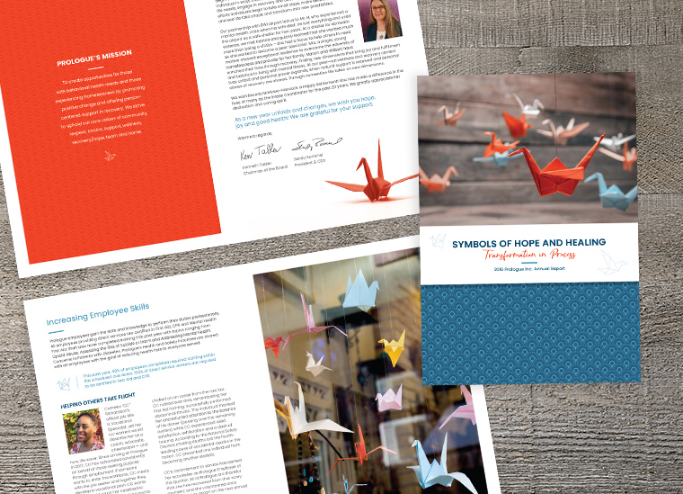
After we establish a theme and develop a cover concept we can tie it all together with imagery, icons, or drawings. One year, we did a theme around growth and used the growth cycle of plants. For another, we used beautiful origami cranes. Those kinds of ideas visually carry through, are easy to understand, and just make it work.”
Making the Numbers Work.
Of course, annual reports are full of data. What’s changed is how that data is presented.
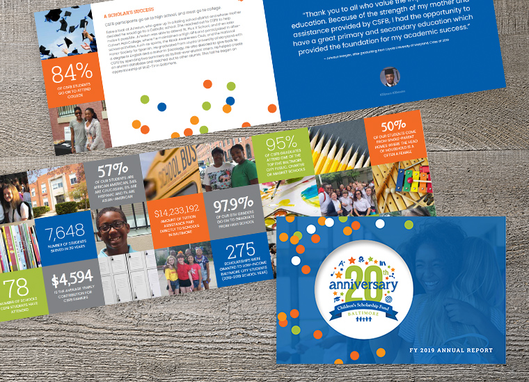
Bethany: “We pull out percentages and key details that show growth. It’s not just about showing the numbers. It’s about making them stand out in an interesting way.”
An important fact to remember: Most readers are scanning, not reading line by line.
Bethany: “One design tool we use is color to draw them in and make it easy to read, so the breakdown is clear.”
The goal isn’t to show everything that happened that year. It’s to highlight what matters most and what made the most impact for the organization.
Don’t Lose the Human Side.
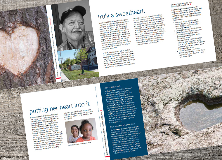
Data tells part of the story. People make it meaningful.
Bethany: “We love using real photos from the organization rather than stock photos of models. When you’re telling an impact story, you want to see the face of the person behind it and how it’s helped them. It makes the message stronger and the stories more powerful. We want to see that impact in the real world.”
That’s what makes someone stop, read, and remember. Which, in turn, keeps the organization relevant in their community.
What We’ve Learned Along the Way
After designing dozens of annual reports, a few things hold true for Bethany:
“Even if it’s been a challenging year, you’ve still helped someone. You have to focus on those things—the little gains.”
“Keep it short. Most people aren’t going to read a full page—they’re scanning.”
Start with a clear idea.
Let it shape the cover.
Carry it through everything.
Because today, an annual report isn’t just something you publish and put on a shelf. It’s something you use.
Let’s Make Your Annual Report Work Better For Your Organization
If your annual report feels like a reporting requirement, it’s worth asking what it could be doing instead.
At insight180, we help organizations turn annual reports into strategic storytelling tools—designed to support marketing, fundraising, and ongoing engagement. If that sounds like something you’re interested in exploring for your nonprofit, reach out.
Let’s talk about your next annual report. Reach out to insight180. We’d love to help!
