
I’ve been wanting to write this blog for a long time. It’s been on my list for months… no years. It’s taken many forms and had a few false starts. Sometimes spurred by a client who wants to fill every inch of the page in their annual report, or use every millimeter in an ad or when their logo must contain specific, literal elements to help visually describe their business. Sigh.
Each time, we patiently try to educate, inform, and inspire them to see greater possibilities — the magic, even — where good design can help simplify the complex, subtly suggest more, and create space to better convey an idea. It’s a beautiful thing.
Lucky for me, a brander with design and communication roots, there are some great books and publications and general rules of design to go back to that remind me and help me educate clients about the nuances of design. And while design rules are often meant to be broken, having the basic principles at our fingertips helps reinforce our creative thinking.
Let’s talk psychology.
…specifically, Gestalt. Gestalt psychology, developed by a group of German psychologists in the 1920s, attempted to understand and describe how people perceive visual information and process it. Simply stated, the whole is different than the sum of its parts, and context matters.
Lucia Wang wrote a beautiful overview in a 2017 How Design article on Gestalt Principles for Information Design:
“The word Gestalt is actually a German one and literally means “Whole.” It also means “Form” and “Shape.” According to this [the Gestalt] theory, “The whole is other than the sum of its parts.” This means that while each individual part has its own meaning, the whole body it creates gives it a complete meaning.
This means that our minds automatically try to simplify visual input, and as a result, we see the meaning of the whole instead of the individual parts. While individual parts can have distinctively different meanings, the whole can take on a completely new meaning that deviates from individual parts.
And how do we see the whole from the sum of all parts? By ways of grouping. According to Gestalt principles, a few laws govern the way we visually group things.”
We make sense of things when we see the whole rather than the individual parts. And the ways we group things are through these five (and some say six) laws or principles:
- Proximity: Objects that are close together are seen as grouped together. Although the shapes and objects may be unrelated, we perceive them as part of the same group if they are within close proximity.
- Similarity: Objects that are similar in ways such as size, color, and shape are automatically assumed to be grouped together.
- Continuity: Once the eye begins to follow something, it will continue traveling in that direction until it encounters another object, such as an arrow with a line at the end of it, indicating to look in the direction the arrow is indicating.
- Closure: The brain has an innate ability to fill in the blanks, to see the missing pieces of an object as long as enough essential information is present. There needs to be a balance between what is still there and what the mind needs to fill in.
- Figure/Ground: Based upon the relationship between an object and the surrounding space, the figure/ground principle is about depth. It is also referred to as positive and negative space, the positive being the object or type and the negative referring to the space around it. This is where “white space” lives.
- Order: Alignment and symmetry (or asymmetry) are attractive and essential elements of design.
The overarching view of Gestalt is that the brain prefers things that are simple, clear and ordered. People will perceive and interpret ambiguous or complex images in their simplest forms. In other words, they will fill in the blanks and make the connections that may not literally be there.
Less chaos. More order.
Let’s face it. We are inundated with messages, ads, posts, scrolling, noise, excess. The best designs are often the simplest designs, and those make the world feel a little less chaotic.
Unless noise is what you’re trying to communicate, lean toward space. It’s more welcoming, attention-getting and more easily processed.
Space can do the following:
- establish contrast, emphasis, and hierarchy;
- generate drama and tension;
- provide visual rest between groups of elements.
Space can also convey attributes other than quality, such as:
- sophistication,
- simplicity,
- cleanliness,
- solitude,
- openness.
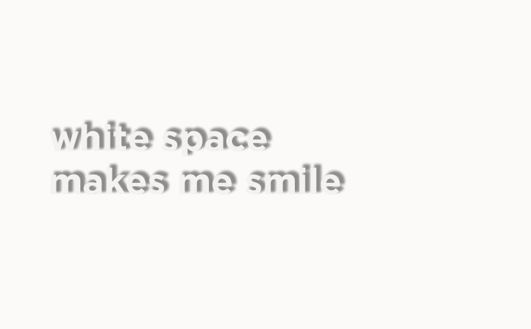
Oh yeah, white space also improves readability and legibility.
White space is a great use of space. You actually waste space by filling it with too many elements and by not allowing it to connect to other space in the design.
Pum LeFebre, of renowned Washington, DC agency Design Army, answered the question: What is white space in graphic design?
She said, “Designers love it. Clients fear it. It’s critical for clear, effective design. And still, some think of white space as “negative.” But the best designers know better. Sometimes, it’s not what you see, but what you don’t see. That’s when white space offers the right amount of…well…nothing.”
A designer can help strike a balance between what is taken away and what remains. We do our best to train clients about the importance of white space, of leaving room, of creating focus, of user experience and drawing the eye in. We try to help clients and audiences view their ads or websites more holistically, instead of just thinking about all the different pieces that “need” to be represented.
Think of white space as the “pause” button to better understand the information.
White space is what makes you stop and take notice in a visual design, it makes you see what’s missing and draws on your feelings. It gives your brain a chance to notice the patterns, to fill in the gaps. White space is definitely not wasted space. It is as much of a design element as color, form, type, or objects.
White space in the “real world.”
Many of our clients are CEOs or emerging leaders of entrepreneurial startups. Their time is at a premium. They need to make decisions quickly and efficiently. White space, I believe, is just as important to business strategy as it is to design. Sometimes stepping away to pause and reflect, making time outside of the day to day hustle and bustle is the absolute best use of time in a busy executive’s day. Often times it’s only when you’ve allowed for that space, the time between the tasks, the time for greater thinking, or even letting go of everything else, that the best ideas come to fruition. I believe it’s why so many creatives often have other artistic and creative outlets (they sing/play in bands, paint furniture, photograph, etc.).
I love how French composer Claude Debussy recognized that “Music is the space between the notes.” As a designer (and singer) who appreciates the space to create with ease and flow, it reminds us that beauty needs a little room. The silent space between notes allows resonance, reverberation, and the time for music to reach its full expression. Likewise, the space around and within a design allows viewers to add their own interpretations and appreciation. And the space to pause and think allows us all to be our better selves.
